
Olivia Wang
.png)
.png)
.png)
My Optus Monitor
Personalized data monitor
My Optus Monitor app improves Optus's customer satisfaction by providing a personalized data monitor and reminder.
Timeline:
March 2021 (7 days)
My Responsibilities:
User Research
UI Design
Introduction
.png)
“Your most unhappy customers are your greatest source of learning.”
People enjoy connecting the world via the internet, but they don’t enjoy paying extras or overpaying, especially without knowing it. To Optus, customer satisfaction not only means a high-quality network but also means reasonable charges. So, in order to improve Optus’s customer satisfaction, I redesigned the My Optus app.
Lots of people have paid extras for data at least once
To find out people’s pain points with carriers, I conducted 6 interviews, 8 card sortings and 21 surveys, then synthesized research results.


According to the research result, 71.4% of people have paid extras for data.

Most people are unhappy with the extra charge
80% of people think the extra charge is unreasonable. To be honest, 1GB for $10 is really expensive.

Overpaying is the main reason for dissatisfaction with the current plan
Among the people who are not satisfied with their current plan, 83.3% are overpaying because they cannot use up all the data provided each month.

People prefer plans according to their previous data usage

Not surprisingly, people care most about data usage

However, the current data usage track cannot meet people’s needs
My research found two types of Optus users. One is the over a user who has the risk of paying extras, and the other is the light user. To find out their pain points, I looked at their journeys on the current My Optus.
Difficult to control data usage
William, the over-user, finds it hard to control his data usage.
.png)
.png)
Hard to know data usage habits
Sophia, the light user, finds it hard to know her data usage habits which may help her to choose a more suitable plan.

.png)
This led to the MVP:
For carrier users, who have issues paying extras or overpaying for data traffic, the My Optus redesign helps users have a better idea about their data usage. Unlike the current Optus, the product provides a personalized data traffic monitor and customized data usage reminder.
.png)
Wireframing and Iteration:
Reminder and Analysis are necessary for data usage tracking.
.png)
The first version about homepage and reminder page

The first version about the analysis page
I tested the first version with six people and made the final version according to their feedback.
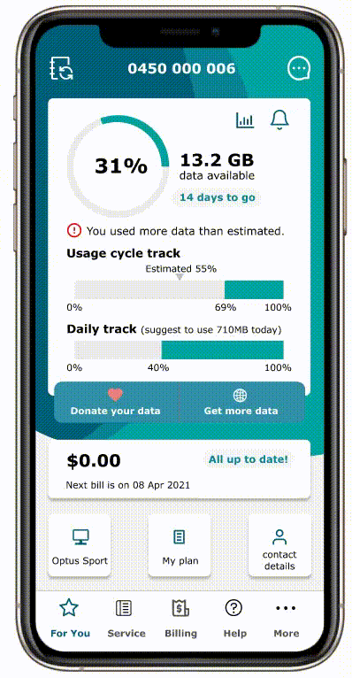
Make data usage tracking and analysis clearer and more intuitive

The homepage shows a clear picture of data usage
.png)
The Analysis page with flexible options

The Reminder page focusing on necessary options
Prototyping & Usability Testing
I tested the final design with five users. The usability test scenario is to track data traffic and make a decision about future data usage.
Then I asked them:
“Are you clear about your data usage now?”
“Are you confident in controlling your data usage now?”
“Can you now determine whether the current plan is the most suitable for you?”
All five people said that now they could better track their data traffic and make a reasonable decision for future data usage.
I tested the first version with six people and made the final version according to their feedback.
Further improving customer satisfaction in the future
Provide plan suggestions according to their previous data usage.
People don’t like to overpay or pay extras, and they need plans which match their actual data needs.
Provide detailed bills.
People want to see bills with date, calls and data usage so they can have a clear vision about the telecommunications service they get.
Track for network problem-solving.
After each network failure, people are very dissatisfied with not knowing when it can be solved.
What I learnt
People need personalized and customized services.
During the user research stage, I found that people mentioned many times “personalized” and “customized”. To them, customer satisfaction means the carrier provide telecommunications services best suited to their personal needs.
There are a variety of ways to track data usage, and carefully choose a way that is easy for users to understand.
We can use a pie chart, bar chart and line chart. We can display data usage within different periods. We can show the average, the top and the bottom usage. However, we don’t need to show all of them, and just pick ones that can best solve the tracking problem.