
Olivia Wang

Reviving Noggin Product
Led accessibility audits
Formulated rebranding strategies
Built a new design system
Redesignd dashboards, tables and forms
A fresh look, a new story.
Noggin is an integrated resilience workspace for operational
risk management, incident & crisis management, and etc.
Timeline:
Jun 2023 - Dec 2023
My Responsibilities:
UX
UI
Role:
UX Designer

"Design is the silent ambassador of your brand."
- Paul Rand
Introduction
Upon joining Noggin, I received substantial feedback highlighting the outdated and flawed nature of the current Noggin product.
To address these issues and develop a modern and streamlined product, as the sole UX Designer, I took charge of conducting Accessibility Audits for Noggin 2.0, adhering to WCAG 2.x standards. I produced an ACR (Accessibility Conformance Report) and collaborated with Product Owners and engineers to rectify accessibility issues. Additionally, I formulated a rebranding strategy, implemented a new design system, and enhanced the user experience by redesigning dashboards, tables and forms.
Problems in the existing Noggin product
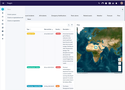
Problem 1: There is no visual coherence at all
After I did thorough research on the Noggin product, I found serious problems with visual coherence.
Inconsistency 1: From different sources
Current icons are from different sources such as GitHub libraries and Noggin code, so it’s difficult for them to be consistent in style.
Inconsistency 2: outlined vs filled
Some icons are outlined but others are not.
Inconsistency 3: with/without background colour
Some icons have a background color, but others don't, even if they're on the same top bar.
Inconsistency 4: centred vs not centred
Images on icons should be centred.
Inconsistency 5: different stroke thickness
All the icons should have the same stroke thickness, or at least be visually similar.
Inconsistency 6: different sizes
Icons are sized differently throughout the product, even on the same bar.
Inconsistency 7: different shapes
Icons with a background color come in different shapes, such as circles, rectangles, and squares.
Inconsistency 8: different colours
Icons have different colours everywhere, such as black, grey, blue and etc.
Inconsistency 9: different proportions
Icons have different proportions throughout the product, even on the same component.
Inconsistency 10: inconsistent modal styles
Inconsistency 11: inconsistent spacing rules
Inconsistency 12: Inconsistent paddings and spacing rules
Inconsistency 13: different font sizes and font colors everywhere
Problem 2: Heavy cognitive load
● Lack of clarity
Using the same icon for different purposes, even on the same screen, is confusing.
● Hard to understand
Some icons don't make people understand what they represent. Images used for icons have no meaning and are not directly related to the icon's function.
● Hard to tell
The icon on the Dashboard Designer button is so small compared to other icons on the screen that it's hard to tell what it is at first glance. Also, I think it should use an edit icon instead of a spanner since a spanner is a metaphor for handyman or repair.
● Poor legibility and poor usability
There are some symbols that do not take into account the application scenarios and do not use the correct colors, resulting in poor legibility and poor usability.
Problem 3: Confusing alignment rules
● There are no consistent alignment rules
Some elements are left-aligned, while others are centered on the same page.
● Bad alignment everywhere
Problem 4: Confusing UI
● Confusing layout
● Incorrect colors for buttons
● Alert’s position can be better
Problem 5: Accessibility issues
● Using color alone to convey meaning is not friendly to colorblind people.
● The font color does not contrast with the gray background color.
● Not enough contrast
● More
Problem 6: Confusing design system
● Messy layout and poorly organization
The current design system is poorly organized and looks chaotic. Organizing and using such a design system is very difficult.
● Using different design systems
It's best to keep all the components in one design system. Currently, they are in different libraries, which is difficult and confusing to use.
● Bad alignment
● Paddings and spacing are not consistent
For example, input components have inconsistent spacing rules.
● Tabs width should not be fix size
● Buttons are not responsible
Action 1: Led Accessibility Audits
How I conducted these audits
I completed the evaluation according to WCAG(Web Content Accessibility Guidelines) 2.x.
While conducting accessibility audits independently, I consistently considered how users interact with our product, fostering empathy for their experience. I actively sought to comprehend the challenges faced by users and am confident that this understanding will enhance my ability to design improved products and services for everyone.
p.s. I used Siteimprove accessibility checker as a secondary tool.
Findings
For confidentiality reasons, I won't go into detail here about the issues I found. Here are some accessibility issues:
● Use of color
● Keyboard
● Focus order
● Link purpose
● Labels and instructions
● Contrast
● Error message
After I completed the accessibility audits, I fixed accessibility issues with Product Owners and engineers.
Action 2: Created Noggin 2.0 rebranding plan
Why I created this plan
To grab the attention of our target customers and retain existing ones, we needed a visually appealing and user-friendly product.
In terms of UI design, the current product is a bit dated, such as bold borders, heavy shadows, old-style tabs, and incorrect placement of the main CTA.
When it comes to UX design, the current product has inconsistencies almost everywhere and has some terrible legibility issues and heavy cognitive load issues. Also, some user journeys are a bit confusing and not easy to navigate.
UX Vision
By rebranding, I hope we can build an outstanding iconic IT solution platform with a simple, clear and concise experience.
The feel we will provide:
Lightweight, easy-to-use, visually appealing, modern and user-friendly.
Designed for everyone.
Professional, consistent and trustworthy.
Steps:
Step 1: Create a new design system
I created a new Noggin design system NDS 2.0.
Step 2: Rebrand the entire product
Process:
1. Redesign every page
2. Use elements from the new design system
3. Optimize the user journey
4. Improve the user experience
5. Welcome feedback from stakeholders, coworkers and maybe some of our customers 6. Iterate the design according to feedback from above sources
Step 3: Implement
1. POs create stories and pass the designs to engineers.
2. Engineers implement the product.
3. After implementation, POs, and engineers do the QA session. I will check whether the implementation is according to the design.
Step 4: Launch the entire product
Pick a big day for Noggin and launch our rebrand.
Step 5: Optimise the product
After launch, we may receive many positive or negative reviews. This will be a great opportunity for us to ease customer frustrations and meet their needs.
After launch, we may receive new requirements, and this time we will have the ability to create consistent and easy-to-use features.
After going live, we may find some opportunities to improve user experience, and we will be confident to iterate our products based on this version.
Action 3: Created a new Noggin Design System NDS 2.0
Elevating Colors: Infusing Vibrancy
Problem
● Presently, Noggin employs dark purple as its brand color and light blue as its primary component color; however, these hues do not complement each other harmoniously.
● The rationale behind the choice of dark purple as the brand color remains unknown.
Solution
● As Noggin functions as a SaaS platform, I've opted for daybreak blue as the new brand color, representing technology, inclusiveness, and creativity.
● In terms of the primary component color, I've chosen sapphire blue for its harmonious complement to the new brand color.
Enhancing Legibility: A New Approach to Font
Problem
● The current Noggin product lacks a coherent font guideline, employing inconsistent font sizes and colors throughout.
● Numerous font sizes are excessively small, compromising legibility, and the font color tends to be overly light.
Solution
● To improve legibility, I've established a fresh font library along with explicit guidelines for both sizes and colors.
Elevating Uniformity: Striving for Consistency
Problem
● The existing Noggin product exhibits inconsistencies in various aspects, including alignment, paddings, spacing, line height, and more.
Solution
● In pursuit of enhanced consistency, I've introduced an entirely new set of components.


Action 4: User Experience Improvement
Enhancing User Experience on the Dashboard
Problem
● The existing dashboard exhibits the aforementioned issues, including misalignment, inconsistency, low legibility, a lack of user-friendliness, and limited accessibility.
Solution
● I conducted a competitive analysis and thoroughly examined numerous dashboards.
● I've employed components from the updated design system to recreate the dashboard user experience, incorporating valuable user feedback gathered during the process.
Before & After: Collapsed
Before & After: Expanded
Before & After: with the guide section


Default

Expand

Collapse

New Behaviour


Guide


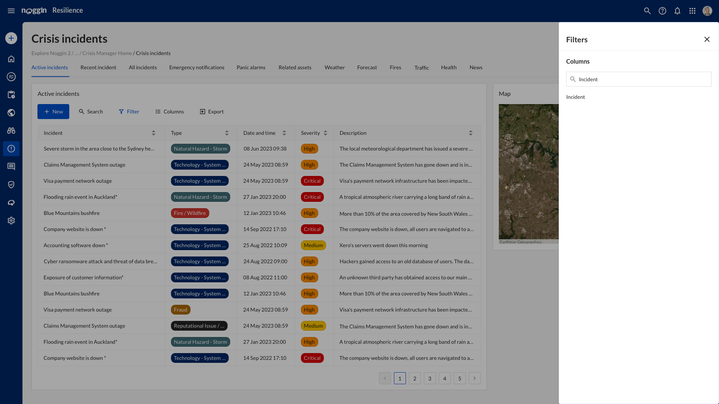
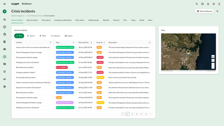
Enhancing User Experience on tables
Problem
● The existing tables lack pagination, occupying significant space with each line and making it challenging for users to view multiple lines on a single screen.
● The current tables have limited functionality, falling short of meeting users' needs.
● The existing tables present significant accessibility challenges.
Solution
● I performed a comprehensive competitive analysis, thoroughly examining various tables.
● Following that, in order to address all the issues and enhance the user experience, I overhauled the tables and their corresponding user journeys.
Before & After: table
Default

Search

Change column width

Edit title

Move column


Edit Columns


Edit Filter


Preview


Enhancing User Experience on Forms
Problem
● Current forms lack dropdown components, forcing users to navigate through a side sheet regardless of the number of options, resulting in a poor user experience.
● The tables on forms appear disorganized and unclear.
● The current forms exhibit issues with excessive padding, spacing, unalignment and inconsistencies.
Solution
● I performed a comprehensive competitive analysis, thoroughly assessing various forms.
● I redesigned three different form sizes, integrating a new dropdown feature.
● I established guidelines for determining when to use a dropdown and when to opt for a side sheet.
Before & After: table
Default
Dropdown


Action 5: Created multiple options
Enhancing User Experience on Forms
In addition to the above designs, I also provide more spacious and modern designs.
Option A
Option C
Option B


How did users respond to it
I presented the new designs to customers during Noggin's User Conference in October 2023 and received a lot of positive feedback. They expressed appreciation for the new colors, layout, tabs, tables, forms, icons, and buttons. The added features on tables were well-received, and they conveyed that the new design is more transparent and user-friendly.
What I learnt
During my time at Noggin, I gained valuable skills as a UX Designer. I conducted Accessibility Audits to ensure compliance with WCAG 2.x standards, and creating an Accessibility Conformance Report (ACR) helped me understand accessibility principles and the need for collaborative efforts to make improvements.
As the sole UX Designer, I took on broader responsibilities, including developing a rebranding strategy and implementing a new design system. I redesigned dashboards, tables, and forms to enhance user interfaces for clarity and user-friendliness.
Working closely with Product Owners and engineers highlighted the importance of effective communication and teamwork for successful outcomes. This experience at Noggin expanded my technical skills and strengthened my understanding of the crucial role UX design plays in creating impactful and accessible digital products.