
Olivia Wang
.png)
Upflowy Flow Creating
.png)
Workflow-based Conversion Optimisation Platform
Upflowy is a workflow-based SaaS platform that helps users design, test, and optimise conversion journeys.
I designed this product as a decision lifecycle system, not just a flow builder.
Timeline:
Apr 2020 - Nov 2021
My Responsibilities:
UX
UI
Role:
Sole Product Designer

"A strong understanding of the outcome customers want, and how they currently get it, is essential for you to succeed in product development."
- Des Traynor, co-founder – Intercom
CONTEXT
Upflowy is a workflow-based SaaS platform that allows users to design, test, and optimise conversion flows.
The core product challenge was that users were not just building flows.
They were actually making structured decisions inside complex multi-step workflows such as signup, onboarding, and lead generation flows.
As the sole product designer, I worked end-to-end across problem framing, workflow design, interaction design, and UI delivery with engineering.
My focus was designing how decision-making happens across the product lifecycle, not just how the interface looks.
PROBLEM
The core problem
The real problem was not a usability issue. It was how users make decisions inside those flows.
Users were:
-
comparing multiple steps mentally
-
struggling to understand what to optimise
-
making inconsistent decisions across flows
-
relying on memory instead of structured evaluation
This created:
-
high cognitive load
-
low confidence in decisions
-
slow iteration cycles
Initially, the product presented flows as isolated steps, which made it difficult to understand optimisation across the full journey.
MY ROLE
As the sole product designer, I owned the UX from problem definition to final UI delivery.
I worked closely with:
-
product to define workflow goals
-
engineering to align on system constraints
-
users to validate decision pain points
KEY UX CHALLENGE
The key challenge was not designing screens. It was structuring decisions inside a workflow system.
There were three tensions that kept showing up.
-
flexibility vs structure
-
speed vs decision clarity
-
system constraints vs user mental model
These tensions shaped most of the design decisions later on.
WORKFLOW REFRAMING
I reframed the problem from a UI issue into a workflow-level decision problem within a flow-building system.
Instead of treating each step as an independent card or isolated screen, I focused on how users evaluate and optimise entire flows across multiple steps.
This shift came from observing that users were making decisions locally at each step, rather than across the full flow.
I introduced a more structured workflow that supports:
-
comparing performance and attributes across steps and variations
-
clearer progression through the flow-building and optimisation process
-
improved visibility of how changes in one step impact the overall funnel
This reduced the need for users to mentally track performance across multiple parts of the flow, and made optimisation decisions more explicit and consistent.
This became the foundation for later A/B testing and analytics features in the product. This also defined how state is maintained and passed across steps in the system.

USER INTERVIEWS
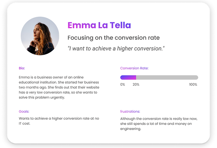
The users are mainly growth managers, product managers, and marketing teams who need to improve conversion outcomes without relying heavily on engineering.
I spoke to 12 participants to learn about their previous experience, needs and frustrations about building and optimising flows.
After synthesising user behaviour, I identified three key user types based on their decision goals:
-
Users focused on conversion optimisation
-
Users focused on sales cycle efficiency
-
Users focused on lead quality and qualification
Each persona interacts with the same system, but optimises for different decision outcomes.
.png)


Affinity Mapping
User Insights
Users were not just building flows; instead, they were making a sequence of decisions across the system.
1. Flow creation as structured decision design
Users need to design conversion journeys quickly without engineering support, often through drag-and-drop workflows and reusable components.
However, the underlying need is not “building flows”, but:
making structural decisions about how a conversion journey should be shaped.
2. Flow evaluation as understanding system performance
Once a flow is live, users need to understand what is working and what is not.
This includes viewing, interpreting, and exporting performance data.
The real challenge is:
turning fragmented performance data into interpretable signals for decision-making.
3. Optimisation as continuous decision refinement
Users want to improve performance over time through experimentation, iteration, and A/B testing.
But without system support:
optimisation relies on intuition instead of structured feedback loops.
4. System connectivity as operational integration
Users need to connect flows to external systems, share them across platforms, and send data to analytics or CRMs.
Underneath this is a need for:
making flow outputs usable across the broader business system.
COMPETITOR ANALYSIS
I looked at products like Typeform and Hotjar to understand how different systems structure flow creation and optimisation.
Instead of comparing features, I focused on how each product shapes user decision-making, especially how users start building flows and how those flows integrate into wider systems.
This helped me identify where most tools support execution, but not the decision structure behind the workflow.

Findings
Across competitors such as Typeform and Hotjar, I noticed a strong consistency in core capabilities.
Most tools support:
-
creating flows from scratch or templates
-
previewing flows before publishing
-
integrating flows into external systems
-
viewing analytics results
However, these capabilities are largely focused on execution and output, rather than how users actually make decisions across the workflow.
Key Gap
One clear gap I identified was that none of the products supported experimentation as part of the workflow itself.
A/B testing, when it exists, is often treated as a separate feature rather than a native part of the flow-building and optimisation process.
Design Implication
This suggested an opportunity to move beyond “flow creation tools” into systems that also support:
how users evaluate, compare, and refine decisions within the same structure.
INFORMATION ARCHITECTURE
Priority List
I used research insights to move from a loose list of potential features to a structured view of what the product needed to support.
This wasn’t just about prioritisation. It helped define the order in which different parts of the system should be built based on how users actually make decisions in the workflow.

Site Map
I translated research insights into an initial site map to define how users should navigate and understand the product.
This wasn’t just about organising pages. It was about making sure the product hierarchy reflected how users approach tasks and make decisions within the system.

USER FLOWS
I mapped user flows across key scenarios to understand how users were making decisions within the product.
This wasn’t just to visualise journeys. It helped reveal where decision points were unclear, fragmented, or unsupported by the system.

DESIGN SYSTEM
I introduced a design system to ensure consistency and speed across a fast-evolving SaaS product.
As the product scaled, we started seeing fragmentation in UI patterns and inconsistent implementation across flows.
The design system helped align design and engineering on shared components and interaction patterns, making it easier to scale the product without re-solving the same decisions repeatedly.

SYSTEM FRAME
The key insight came from user interviews and flow analysis.
Users were constantly switching between steps to compare performance manually.
That showed me they were reconstructing the system in their head instead of using the product to support those decisions.
That’s when I realised this was a decision system problem, not just a UX problem.
So I reframed the product from a flow builder into a decision system.
Instead of thinking in screens or flows, I defined the system around three decision layers.
Each layer maps to how user actions, data, and system state are structured in the product.
1. Structural decisions
How a journey should be designed
2. Interpretation decisions
How performance should be understood
3. Refinement decisions
How the system should improve over time
This became the foundation for all design decisions.
DECISION SYSTEM DESIGN
Instead of describing features individually, I structured the UI around key decision moments in the workflow.
-
makes flow structure visible while users build it
-
connects performance back to specific steps
-
helps users compare and interpret changes across the journey
This reduced the need for users to mentally track everything themselves.
STRUCTURAL DECISION LAYER - FLOW CREATION
At this stage, users are deciding how the conversion journey should actually work.
Tension hints:
-
users were unsure what “good structure” looked like
-
system constraints were not visible during creation
-
users lacked feedback on how structure impacts outcomes
The interface solves this by:
-
making the flow structure visible as users build it
-
helping users understand how steps connect across the journey
-
allowing flexible editing without losing the overall flow context
Key principle: users should always understand the structure they are building.


.png)
INTERPRETATION DECISION LAYER - FLOW EVALUATION
At this stage, users are trying to understand what is or isn’t working in the flow.
Tension hints:
-
performance data was too fragmented across steps
-
users were unsure what to compare across flows
-
insights were not actionable inside the workflow
The interface solves this by:
-
making drop-off and engagement patterns easier to understand
-
showing where users lose momentum across the journey
-
connecting performance back to specific steps in the flow
Key principle: performance data should help users decide what to improve next.
.png)
REFINEMENT DECISION LAYER - OPTIMISATION & EXPERIMENTATION
At this stage, users are iterating on and improving the flow over time.
Tension hints:
-
optimisation was happening outside the system
-
users struggled to link experiments back to structural decisions
-
iteration required switching between multiple tools
The interface solves this by:
-
embedding A/B testing within the same workflow context
-
enabling comparison of variations within a shared structure
-
connecting outcomes back to specific structural decisions
Key principle: experimentation should operate inside the decision system, not as a separate layer.

UI AS EXECUTION LAYER
UI is not the main story.
UI reflects the underlying system state and decision context, rather than static screens.
Its role is to:
-
surface decision context at the right time
-
make system behaviour interpretable
-
enable action within the workflow
The UI exists to support decision-making, not define it.
KEY TRADE-OFFS
The key trade-off was between flexibility and decision clarity.
A fully flexible system gives freedom, but reduces consistency in decisions.
A fully structured system improves clarity, but can feel restrictive.
I prioritised structured decision-making first, then introduced flexibility through iteration and experimentation.
This ensured users could move quickly while maintaining decision clarity.
OUTCOME
This reframing changed how users interacted with the product.
Instead of thinking in isolated flow steps, users began operating within a structured decision system.
This resulted in:
-
clearer journey design
-
more consistent interpretation of performance
-
faster iteration cycles based on system feedback
-
improved confidence in optimisation decisions
WHAT I LEARNED
This project reinforced that:
Design is not about screens or features.
It is about defining how decisions are made, interpreted, and refined inside a system.
UI is simply the medium through which that system becomes usable.
That shift changed how I approached the project overall.
